Vanity Fair Magazine
Art direction and design for Vanity Fair.
Design Director: Chris Dixon
Art Director: Hilary Fitzgibbons
Custom type by Alex Trochut
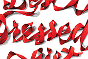
Art direction and design for Vanity Fair.
Design Director: Chris Dixon
Art Director: Hilary Fitzgibbons
Custom type by Alex Trochut
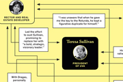
Editorial design for The New York Times Magazine.
Design Director: Arem Duplessis
Art Director: Gail Bichler
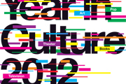
Art direction and lead design for features and special issues.
Design Director: Thomas Alberty
Art Director: Randy Minor
Deputy Art Director: Josef Reyes
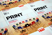
Complete redesign of Print Magazine, including new logotype, typography, and interior structure. Launched in February 2011.
February issue cover by Project Projects
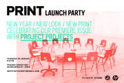
New logotype and visual direction for the Print brand, launched concurrently with the magazine redesign.
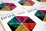
Print magazine's Regional Design Annual is the most comprehensive survey of graphic design in the United States, containing 200 pages of award-winning work, and the only design annual organized by geography.
The country is divided into six regions: Far West (judge: Lucille Tenazas), Southwest (judge: Randy Hunt), South (judge: Leland Maschmeyer), Midwest (judges: Gary Fogelson + Phil Lubliner), East (judge: Jennifer Kinon), and New York City (judge: Ken Carbone).
Using Google maps, urban and rural landscapes from each region were sliced and formed into color-specific patterns.
Concept, art direction + editorial design by Tonya Douraghy
Pattern illustrations by Dave C. Frankel
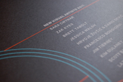
Poster and custom typography for Print magazine's 2011 New Visual Artists exhibition, celebrating 20 artists under the age of 30.
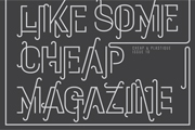
Poster and custom typography commissioned by art and photography magazine Cheap & Plastique for the launch of issue 10.
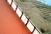
TIME / PLACE is a book series as well as a digital archive designed to document subjective accounts of what war is like from the point of view of ordinary citizens.
TIME / PLACE explores the political history of modern border conflicts through personal narratives.
Each book in the series focuses on one conflict. The first book of the series is TIME / PLACE: 1980-1988 Iran AND focuses on the Iran-Iraq War. The conflict is presented in three layers of depth: Facts, which builds a framework through timelines, maps, and data; Voices, personal stories from the war, annotated with relevant history, dates, and translations; and Landscapes, which uses photographs to document what the conflict really looks like on the ground.
Conceptualized, researched, designed, printed + bound by Tonya Douraghy for the graduate thesis at MFA Design, School of Visual Arts.
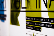
Poster set for a lecture by Omar Vulpinari, the Creative Director of Visual Communications for Fabrica. Designed for the School of Visual Arts MFA Design department.
Winner of the Art Director's Club 88th Annual Awards Bronze Cube for Television & Cinema Design: Music Video.
Typographic music video for the song "First Day" by the Futureheads, using only black and white type. The video was designed in After Effects using original hand-drawn typefaces Darn and Jerky.
[Instructor: Gail Anderson]
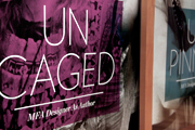
Poster set designed for the 2010 Thesis Forum at the School of Visual Arts MFA Designer As Author program. Using the existing theme and title of "Unleashed," we illustrated synonyms of the word with images from pop culture.
[Designed in collaboration with Matthew Stipano]
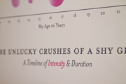
A personal infographic detailing all the crushes I've had which I never acted upon. Circles indicate the duration of each crush and color intensity relates to intensity of feeling, while solid and dashed lines indicate their romantic relationships with others.
[Instructor: Scott Stowell]
Commissioned by Adobe to design print and iPad publications for Seattle non-profit Youth In Focus.
Click here to download the Youth In Focus App
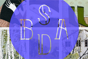
Custom type, animated logo, and e-commerce site for Buy Some Damn Art, an online resource for affordable original art.
Programming by Alan Oliver
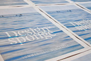
Commissioned by Design*Sponge to design their Summer 2011 Newspaper.
This limited run of 10,000 was distributed in various locations in 25 cities across the United States.
Visit www.designsponge.com to find a location to pick up a free copy.
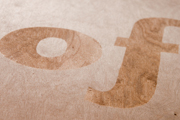
Commissioned by Studio Matthews, three 16"x16" panels were created to illustrate the advantages of using sustainable design materials. Using birch veneer, honey, found paper, and custom rubber stamps, these panels encourage designers to use materials they can find in their everyday environment.
Panels exist in a collection of over 20 panels, created by various designers, as part of the Smart Matter installation to be displayed permanently in the Division of Design at the University of Washington and at Studio Matthews in Seattle, Washington.
Project to be completed in 2011
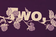
Silkscreened poster made of 12 perforated seasonal postcards designed to be detached and mailed as a friendly greeting to someone in your life, one for each month.
The poster was designed for the Seattle-based exhibition The HELLO Poster Show. The theme of the exhibition called for open interpretations of the greeting 'hello.' The design encourages open communication and interaction with the poster, supporting the dynamic nature of this simple greeting.
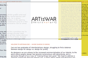
Website for recent design graduates to share work and experiences with their peers. The site is divided into three sections which are layered and scroll independently of one another. The site contains additional pages for archiving old posts, as well as a space for users to sign up for an account and post original content.
[Site coding by Alan Oliver]
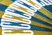
Identity for San Francisco accessories design duo Cheese Cream, with graphic elements inspired by the company's hand-made aesthetic. Includes business cards, letterhead, envelopes, and merchandise tags.
Website redesign, including splash page, for American River College Department of Horticulture.
WEB.ARC.LOSRIOS.EDU/~HORT
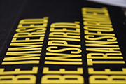
Summer catalog/poster, brochure and related pieces of print for Pilchuck Glass School, one of the most prestigious glass centers in the world.
In collaboration with Kristine Matthews, Art Director and Cassie Klingler, Designer
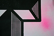
Stamping just got serious with this oversized custom rubber stamp. We took to the streets and ransacked our studios gathering an array of found paper to brand with our T-shaped mark. A collection of these prints were bound into a monstrous notepad for AIGA Portland's Graffiti Type Showcase.
Our rendition of the letter T is one of the 26 letters of the alphabet created by various artists/designers for AIGA Portland's GRAFT: Graffiti Type Showcase, during Design Week Portland, 2012.
Designed in collaboration with Cassie Klingler.
Laser stamp magic thanks to Sean Douglass.
Custom rubber stamp / Found paper / Ink / Mayhem
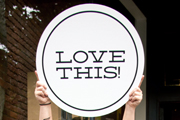
Dear Seattle is a storefront pop-up space designed for the Seattle Design Festival. Four different interactive features let you contribute your ideas about design and the future of the city.
Designed in collaboration with Cassie Klingler and Kristine Matthews.
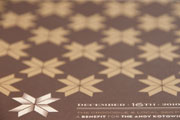
Promotional poster for The Andy Kotowicz Foundation Benefit, commissioned by The Crocodile, Seattle.
19x26" / silkscreen on kraft stock
Designed in collaboration with Benjamin K Shown.
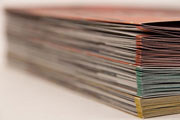
This thesis explores new systems of gathering and archiving the complexities of cultural traditions and personal relationships. Specifically, the role of food as an amplifier and catalyst for these relationships was investigated.
Eat/Gather illustrates this parallel in a book series chronicling the making of seasonal Japanese American foods. In each volume, personal stories told by the Nisei (2nd generation Japanese Americans) are woven together to narrate the shared process of making one specific traditional food.
The accompanying exhibition and website offer interactive experiences for people to discover these traditions and share their own experiences. These two resources not only serve as an alternative place of discovery but also as a tool for gathering new information for further investigation.
Conceptualized, researched, designed, printed + bound, installed, and programmed by Alanna MacGowan for the MFA Design graduate thesis at the University of Washington, Seattle.
To purchase the Eat/Gather thesis book, visit: BLURB.COM
This book details the entire thesis project and is separate from the three Eat/Gather volumes.
For more, visit: EAT-GATHER.COM
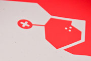
Promotional poster for The Hello Poster Show / Goodbye Edition.
19x26" / silkscreen on kraft stock
Designed in collaboration with Benjamin K Shown.
For more, visit: hellopostershow.com
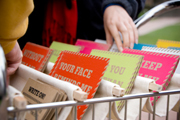
Write On! is a roving exhibition offering the public a chance to spread some positivity by mailing a hand-silkscreened postcard, free of charge, to a friend or foe.
In collaboration with Marisa Mickelson, Kimberly Shedrick and Benjamin K. Shown
For more, visit: POSITIVEPOST.ORG
Instructor / Kristine Matthews
In November 2009, Benjamin k Shown and Alanna MacGowan started The HELLO Poster Show, a fundraising exhibition featuring over 30, 19x26" silkscreened prints inspired by the greeting 'hello.'
The call for entries for Hello poster designs is open to all. Participants have included UW students, faculty, alumni and professional designers worldwide.
All posters from the exhibition are available for purchase with proceeds benefitting local Seattle charities. To date, posters have sold to a worldwide audience raising over $6000.
In April 2010, the juried Goodbye Edition of the show opened in Seattle to an enthusiastic crowd of Hello Poster Show enthusiasts and newcomers.
The show/benefit model is open to all who wish to organize their own Hello Poster Show. The show has recently been adopted by Leisha Muraki in Melbourne, Australia and is set to open 15 December 2010.
Past Hello beneficiaries /
Wellspring Family Services.
826 Seattle.
U-District Food Bank
ROOTS Youth Shelter
Circle of Friends for Mental Health
HELLOPOSTERSHOW.COM
Branding consultation and identity design for event coordination company, Plush.
Originated color scheme, logo, and layouts to create the business card, letterhead, envelope and website.
plushweddings.com
Website programming in collaboration with Alan Oliver
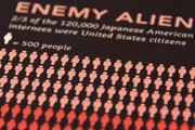
A series of info graphics exploring over five generations of Japanese American immigration and assimilation.
Instructor / Karen Cheng
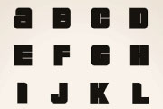
Original typeface design inspired by toxic US Superfund sites. This unicase face includes numerals, symbols/punctuation, and 15 alternates.
Instructor / Karen Cheng
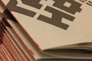
An original Alternate Reality Game created to challenge the way humans interact in their everyday environments. Tally Ho challenges people to seek out existing groups of four objects or shapes within the environment and tally that group with a fifth line.
In collaboration with Benjamin K Shown.
Advisor / Dominic Muren
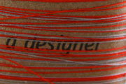
A 300 word personal design manifesto. 300 descriptive characteristics were printed on individual pieces of kraft stock and fabric, then sewn together end-to-end. The piece can be neatly wound up or unraveled to reveal the ordered chaos that lies within.
Instructor / Kristine Matthews
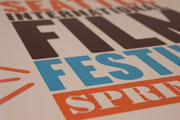
Marketing materials for the 35th Annual Seattle International Film Festival. The program included: 2-sided folding poster/mailer, program booklet, 20 second promo bumper, tickets/press passes, environmental components, and a takeaway item.
The theme of the program was Find Your Moment, a sentiment visualized with a simple icon made of three dashed lines used to emphasize the place and time when your SIFF moment was realized.
Instructor / Annabelle Gould
